Tips and techniques
Every animation—from simple linework pictograms through expansive, high-fidelity 3D—requires a different approach and new solutions. However, the following guidance is universally applicable to every execution.
Examples
Attention
Motion is exceptionally useful in capturing attention. How we use motion to direct that attention is essential in effectively communicating with the viewer.
Focus
Maintain a focal point of interest and seek out a seamless means of transferring it from one subject to the next. A viewer’s attention is an investment. With the brief and dense nature of most animation, be cognizant of how you capture and shift a viewer’s focus to minimize confusion and fatigue.
A commanding performance begins this sequence that leads the eye from right to left.
Camera
Cameras are the mechanism through which we present our view of the world to an observer and, therefore, must be treated with the utmost care to maintain an attitude of confidence and positivity.
Efficient, single-axis translations feel deliberate and unobtrusive, while untethered, dynamic moves impart a sense of chaos and uncertainty. If creating a dynamically animated camera is absolutely necessary, ensure its movement remains controlled, clearly focused and positioned to create balanced compositions.
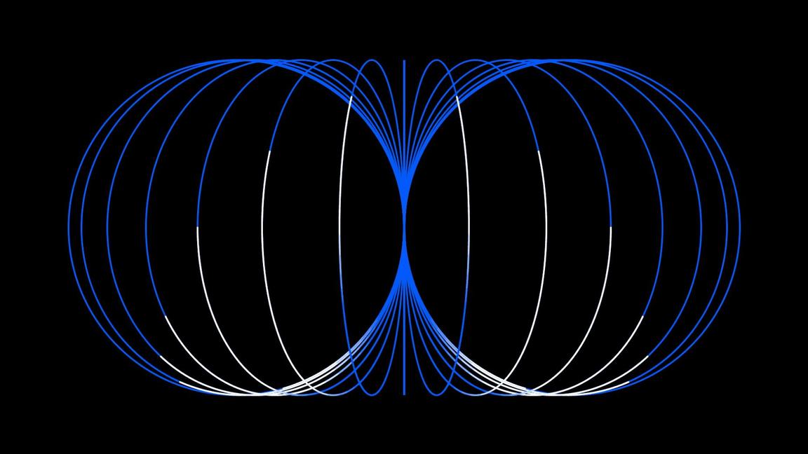
Controlled camera movements support action.
Avoid uncontrolled action cameras.
Visual clarity
Our animations should be simple and straightforward in their effect by not only respecting the integrity of their original design but also by enhancing and evolving it.
Complexity
Every element in a composition has the potential for movement, but every movement of an element increases the density of information presented to a viewer. This dynamic intuitively leads us to apply an inverse relationship between the complexity of a design and the complexity of an animation. In general, minimally populated compositions lend themselves to more expressive and expansive animation, while dense and complex designs benefit from smaller, more textural motion.
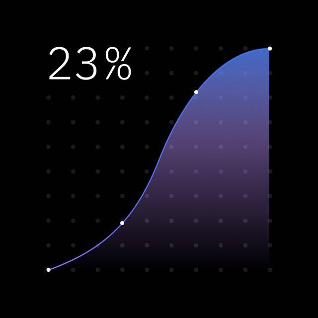
Detailed visuals call for subtle animations.
Simple designs allow for dynamic animation.
Detail
In animation, the accuracy of a form in any key pose should adhere to the same rigorous standards used in creating the design. During transitions from one key to another, strive to maintain clean and precise silhouettes by avoiding odd shapes, irregular angles, overlaps and intersections, unless explicitly desired as an effect.
A similar level of attention should be paid to the briefest of moments. For example, avoid creating irregularities during the overlap of transparent shapes by animating between swatch colors, not opacity. Maintain crisp graphic lines by increasing the stroke weight from zero to the thickness, not crossfading.
Animated stroke weights maintain clean and crisp lines.
Avoid distorting shapes and cross-fading opacity.
Consistency
Animate with a consistency of motion both systematically and specifically.
Making broad, consistent choices defines a framework for how we present information and make it understood, especially in more technical scenarios. Seemingly inconsequential distinctions, like which direction elements move in and out of frame or how crossfades and type behave, are foundational to creating a sense of reason and purpose.
In more illustrative scenarios, consistency can help demonstrate the role and function of abstract elements or define a baseline of behavior against which abrupt changes and influences become more noticeable. Setting expectations and, in some cases, subverting them is an excellent way to convey novel cause and effect, and imbue even simple forms with personality.
Reward expectations through consistent choices.
Avoid the misinterpretation that can follow capricious movement.
Personality
Our animations should always seek a balance between natural and engineered in tone and behavior. Unless essential to the story, nothing should feel coldly mechanical or overtly organic—it’s both working in cooperation that imparts a subtle, yet appreciable, personality.
Precision
Elements move decisively, efficiently and with purpose. Align to the grid. Snap into place. Use momentum to instigate crisp transitions. While no single detail will be immediately noticeable, this precision and attention to detail is palpable and felt when applied holistically.
A clear intent and precise movements communicate purpose.
Avoid superfluous motion.
Rhythm
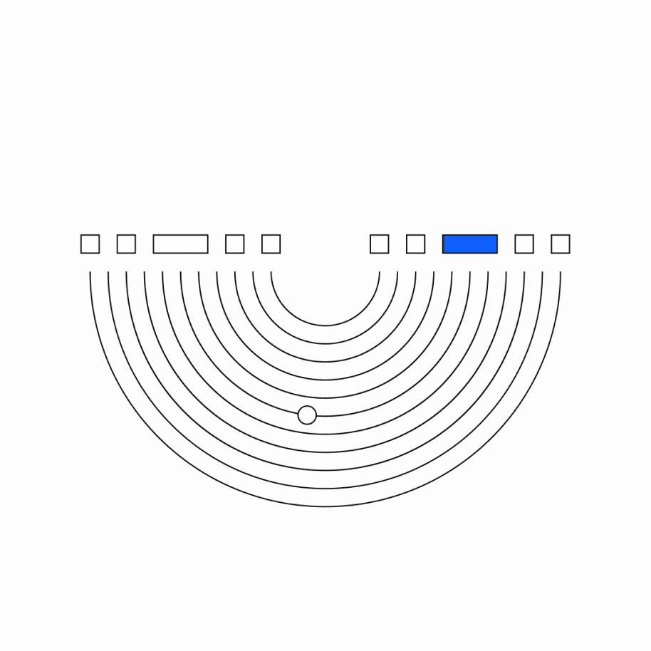
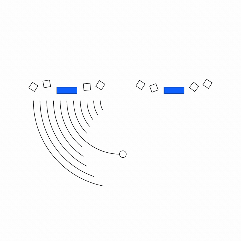
Establishing a sense of rhythm in motion is essential to well-paced and understandable animations–rarely does everything happen at once. No matter which tactic you use to choreograph action into sequences, they all contribute to an ebb and flow of activity that creates a pleasing rhythm and allows the viewer a mental pause before continuing. Tactics can include translating objects along already defined paths with slightly offset timings, showing deliberate moments of cause and effect or allowing elements to move purposefully and then rest.
Achieve effective rhythm with staggered hero performances.
Offsetting similar actions by small increments can be effective.
Fluidity
A well-animated object should feel effortless and elegant, with a fluidity to its motion—not in the path it takes, but the finesse with which it moves. Pay close attention to how each attribute is animated and the transition between movements.
In general, refrain from employing stepped, stilted or disorderly motion. Technically, motion requires animating at or above 24 frames per second (FPS) to help ensure smooth performances.
Aim for smooth and seamless movements.
Don’t use a frame rate lower than 24 frames per second.
Physicality
When applied selectively, animation that feels physical is an incredibly effective means of adding interest and personality to your designs, whether they’re overtly dimensional or recognizable elements, or simple graphic shapes.
Mass and momentum
Charm and spirit can be produced through collisions, moments of friction and slides. However, be deliberate and considered when moving elements—avoid cartoonish overshoots and bounces.
Volume
Consider what the element to be animated represents, especially in higher-fidelity and dimensional executions. Intuitively, viewers expect things to behave as they do in reality; feathers shouldn’t fall like lead, stone shouldn’t stretch like rubber. Treating recognizable objects with a sense of stylized realism can be an effective way to create interest.
Use motion that underscores the object in reality.
Avoid motion that contradicts the object in reality.
Structure
Animated illustrations inevitably fall into one of two categories—sequential or looped. Although a technical specification, this distinction also helps to define how a message is structured.
Sequential
Sequential animations are intended to depict a sequence of events with deliberate start points and endpoints—an A to B narrative. Whether they then settle into a loop state or reset to begin again, sequential animations are typically more anecdotal and linear in their message than loops.
Sequential movement leads a viewer along a prescribed path.
Simple loops
Loops continue in a usually seamless cycle and often only convey a singular idea or message. The loop may be a series of states aligned to one topic or an overall ambient effect that draws focus and sets a particular tone.
Use simple loops to convey individual concepts.
Nested loops
Offset loops to guide attention in sequence from region to region.
Avoid excessive overlaps in action.
Type
Type is an essential component of our communications. Accordingly, care must be taken in animation to present type in a manner that’s natural and understandable to our viewers.
Presentation
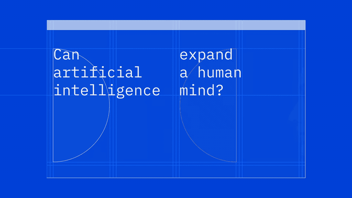
Whether revealing a block of type as a whole or animating individual elements—line by line, word by word, even character by character—our approach to type should reinforce the natural rhythm of reading, typically by appearing left to right, top to bottom. And, as with graphic elements, type should only be animated on one axis at a time, and be left in the frame long enough to be legible and comprehensible to the viewer.
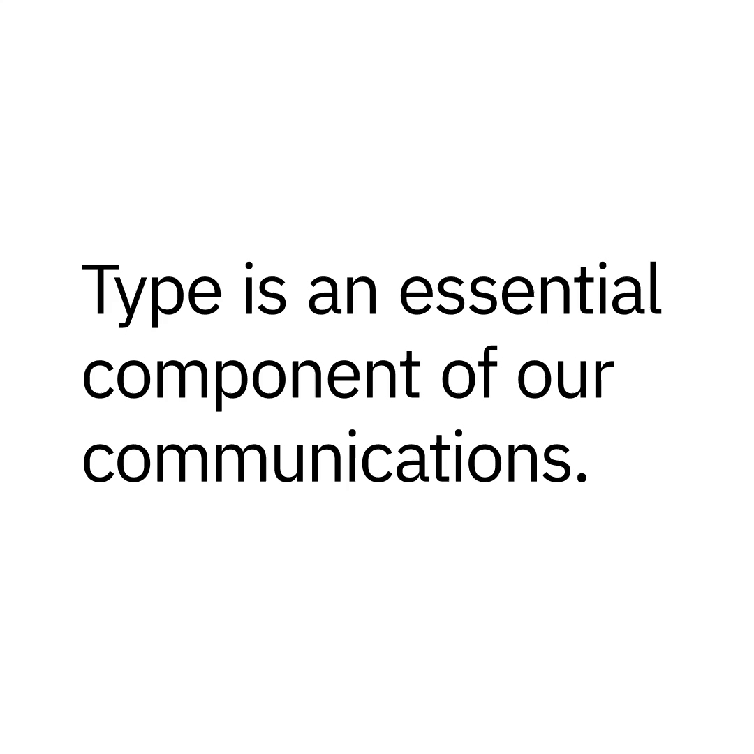
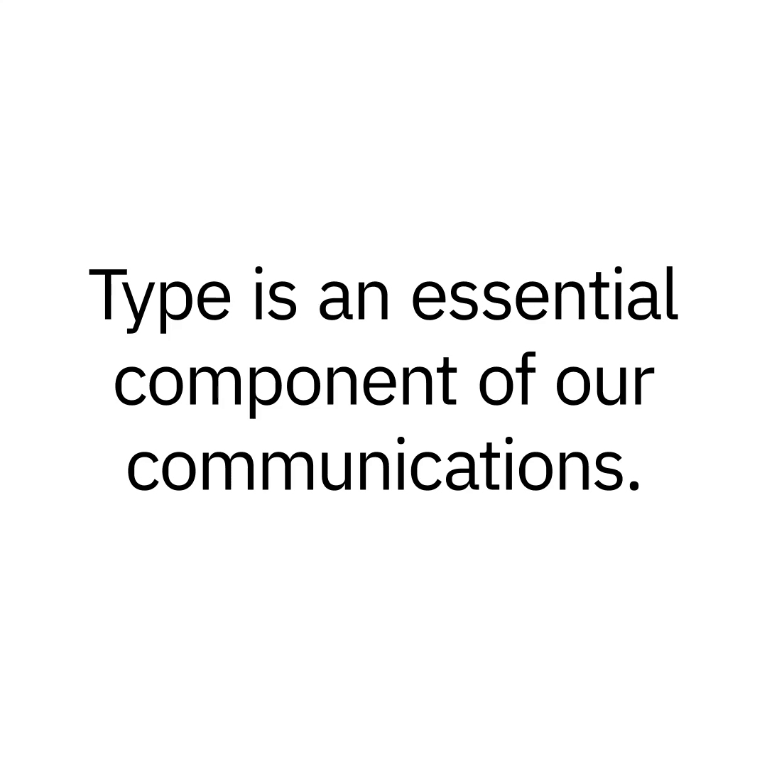
Reveal type with orientation that supports comprehension.
Avoid centered paragraphs and revealing type over multiple axes simultaneously.
Integrity
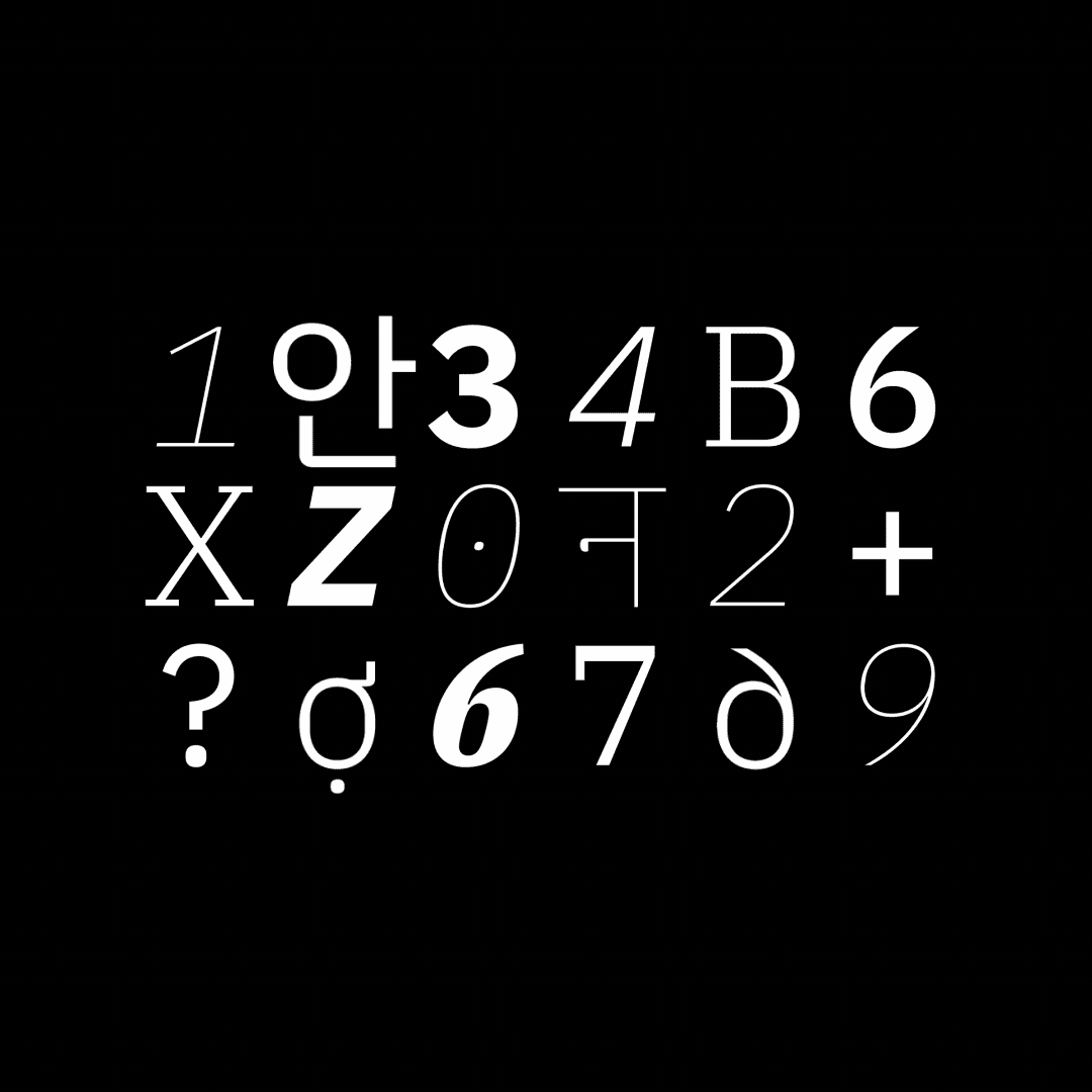
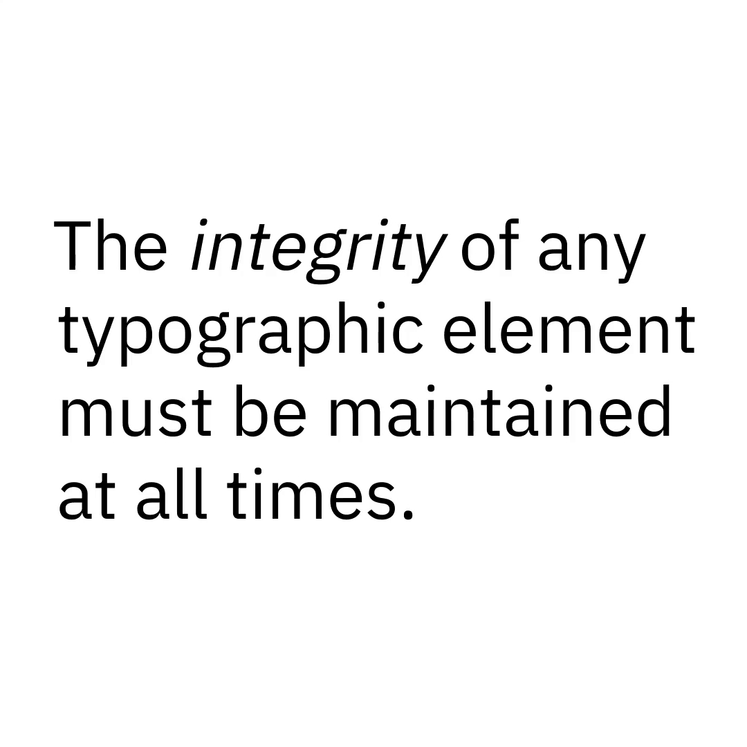
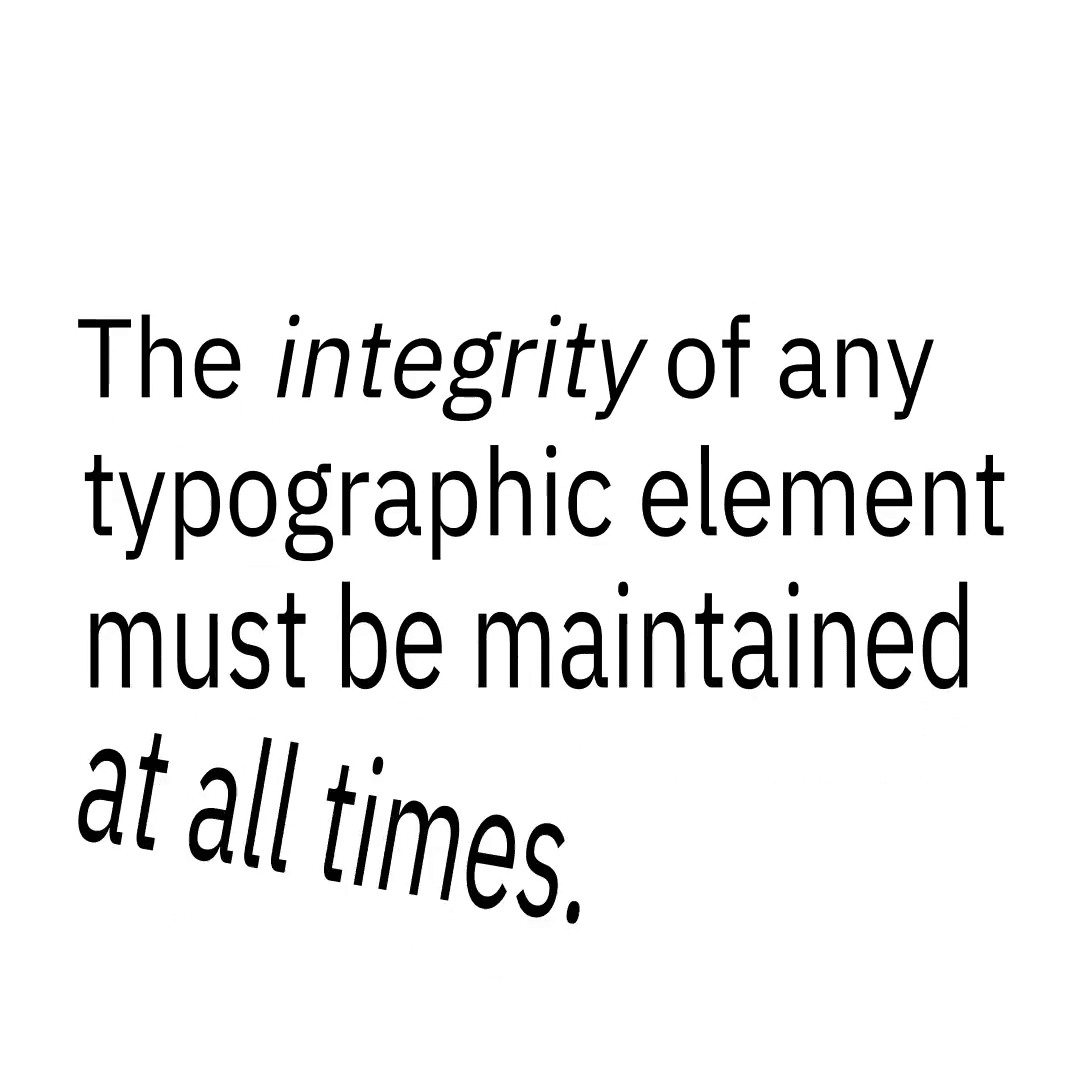
The IBM Plex® typeface is designed to be a representation of our brand, where every detail reflects a decision made with purpose. As such, the integrity of any typographic element must be maintained at all times. Refrain from stretching, warping, or otherwise distorting any form or detail, regardless whether it’s a single glyph or an entire paragraph.
