About cookies on this site Our websites require some cookies to function properly (required). In addition, other cookies may be used with your consent to analyze site usage, improve the user experience and for advertising. For more information, please review your options. By visiting our website, you agree to our processing of information as described in IBM’sprivacy statement. To provide a smooth navigation, your cookie preferences will be shared across the IBM web domains listed here.
Technical diagrams
This guidance details the creation of technical diagrams in documentation and technical content. Technical diagrams are visual representations that illustrate the structure, components, and relationships within a system or process. They provide a clear and concise way to communicate complex information like relationships, hierarchy and sequence.
Resources
The Technical diagrams starter kit (.ai) can be used by both internal and external users. In Figma, if you are an internal user, follow the Technical diagrams guide to enable the Technical diagrams library, which provides drag-and-drop components to be used in technical diagrams. If you are an external user, open the Technical diagrams library (External users) in your Figma drafts. Then copy it into your Figma team, to publish it as a library for your team’s use.
Examples
Nodes
Technical diagrams consist of nodes and connectors. The nodes come in three different formats: bullet, small and large. They can have various shapes and colors and make use of iconography or not. The meaning of nodes in a diagram depends on the type of diagram and the specific use case.
Bullet nodes
Bullet nodes are useful for tree diagrams, dendrograms, and other types of very dense network diagrams. They are the most compact form of a node. If using a horizontal label format, the node shape appears to the left of the primary label text. If using a vertical label format, the node shape appears centered above the primary label. They are usually not mixed with other types of nodes in the same diagram. They shouldn’t be used with long names or descriptions.
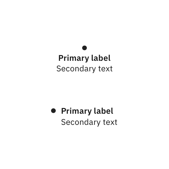
Vertical and horizontal types of bullet nodes
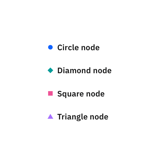
Examples of color and shape variations for bullet nodes
Small nodes
Small nodes are useful to represent concepts and relationships in simple layouts, such as high-level presentations or overview diagrams. For complex diagrams, small nodes can also appear with large nodes in the same diagram.
Small nodes always need to include an icon and usually place more emphasis on color than the other types of nodes. We recommend you avoid long names or descriptions.
Vertical and horizontal types of small nodes
Examples of color and shape variations for small nodes
Large nodes
Large nodes are appropriate for elements that require more room for longer names and descriptions, and are usually used in more complex technical diagrams, where the text carries the most meaning. In general, they take up more space than bullet or small nodes, but are an excellent choice for layouts where nodes need to create clear columns or rows, such as swimlane diagrams and organizational charts. Large nodes can be used with or without an icon.
Large nodes with icons
Large nodes without icons
Examples of color and shape variations using a White background
Examples of color and shape variations using a Color 10 background
Text behavior in large nodes
The three different types of large nodes can all accommodate more or less text, or have other nodes nested in them. Click the tabs of the switcher shown here to see how they behave in various scenarios.
Nesting
All large node types can expand to allow for nesting. All other types of nodes can be nested inside an expanded large node.

Example of expanded large node with solid color block
Example of expanded outlined large node
Connectors
Connectors, sometimes called links or edges, represent relationships between nodes. Depending on the type of diagram, a number of line styles and endings can be used to represent various types of relationships.
Connectors can also use different colors. However, to avoid color blindness accessibility issues, it’s best to use color in combination with labels or line styles so that any difference can be accessible to all users. Since line styles and color can have different meanings, depending on the diagram, be sure to include the definitions in the legend.
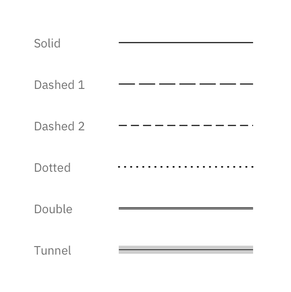
Examples of line styles
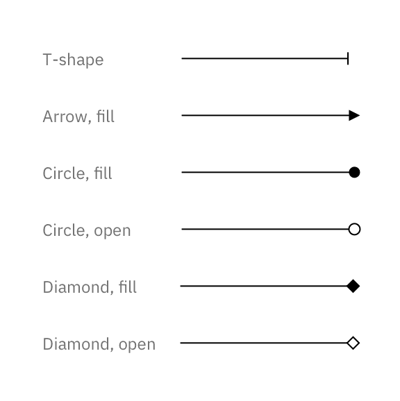
Examples of ending styles
Routing
The shapes made by connector lines can vary from use case to use case. As a default we recommend you draw connectors orthogonally on the grid, using straight or rounded elbows, especially when using large nodes. However, some diagrams may benefit from using straight lines from node to node, while others might require bezier curves to help legibility.
Square elbow connection
Rounded elbow connection
Straight connection
Bezier connection
Iconography
Because technical diagrams can be very complex and use icons at small scales, UI icons should be used for most iconography needs. The icons used in nodes are 24px, while the icons used in labels or as indicator badges are 16px. If you don’t find an appropriate icon in the IBM Design Language UI icon library, you can request to add your own design using the approved UI icon contribution process. Use either a White or a Black icon, depending on the background.
IBM app icons can also be used if you need to represent a specific IBM product. Use either the color version on a White or Black background, or the monochrome version on a color background, following the same rules as UI icons.
Use of Black or White UI icons, depending on the fill color
Use of app icons on monochromatic and colored fills
Logos
There are situations where, instead of icons, you may need to use a logo. Keep this option as a last resort, and only use it if you really need to emphasize the brand. For third-party companies, be sure you have legal approval to use their logo, and comply with their brand guidelines. If the logo used has square proportions, constrain it within a 24px x 24px container. If it’s a much wider or taller logo, it’s best to type out the name of the company and use an icon instead, or opt to use no icon. As a general rule, keep the background White when using a logo, and you can choose to use a color for the outline.
A logo can be placed in a square container.
Spelled out company names can be used with or without icons.
Typography
The default typeface for technical diagrams is IBM Plex® Sans. The type specifications are shown here.
| Element | Size | Weight |
|---|---|---|
| Node primary label | 14/18px | Semibold |
| Node secondary text | 14/18px | Regular |
| Connector label | 12/16px | Regular |
| Text badge | 12/16px | Regular |
Alignment
Horizontally, type is almost always left aligned, with a few exceptions: when placed underneath the shape, the type in bullet nodes and small nodes is centered on the shape.
In nodes with left-aligned type, alignment depends on the amount of text. If text is just one or two lines, vertically center it. If more than two lines, top align the text. Use an 8px top margin, excluding top leading.

Don’t alter the color of the text.
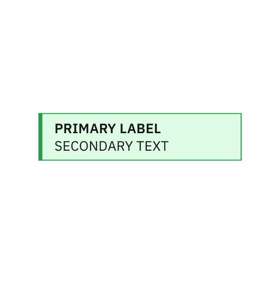
Don’t use all caps except for acronyms.
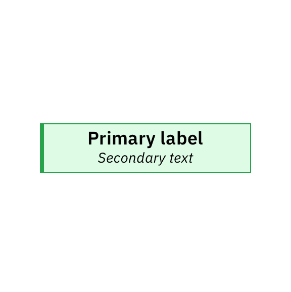
Don’t change type size and alignment specifications.
Don’t use unnecessarily long label names. Consider adding longer descriptions outside the diagram.
Grid and spacing
Use the guidance shown here when creating a diagram to increase legibility and maintain adherence to the IBM Design Language.
Drawing a node
All nodes are built on an 8px grid. The small and large nodes start from a 48px default height. The default outline weight for all nodes is 1px, and the default icon size is 24px. Text margins are 8px for bullet nodes and small nodes, and 16px for large nodes. Use an 8px radius when rounding corners. The node behavior when the labels are longer is described in the typography section, while nesting is detailed in the nesting section.
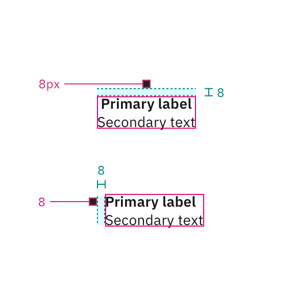
Bullet node specifications
Small node specifications
Large node with icons specifications

Large node without icons specifications
8px radius for rounded corners
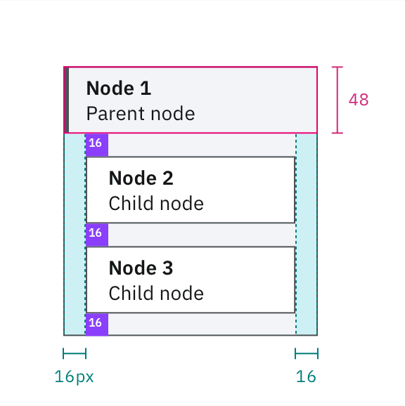
Spacing within nested nodes
Drawing on the grid
Drawing a technical diagram starts with an 8px grid. All nodes and connectors should snap to the grid. For an orderly diagram, keep connector snap points on the grid, and align elements with each other whenever possible. Since 48px is the default size for nodes, a 48px grid overlay could help the alignment.
Artboards
Working with as few artboard sizes as possible will ensure size consistency for diagrams across your project. It’s recommended to use one of these standard size artboard widths: 1584px, 1312px or 1080px. Also, try to use one of our standard aspect ratios: 16:9, 4:3, 2:1 or 1:1. Be intentional and consistent when using other sizes and aspect ratios.
Color
Technical diagrams can use the full IBM Design Language color palette while considering accessibility requirements. Each team can create their own subset to match their needs. A legend is always needed, even when a predefined color set is used.
Color usage
These color guidelines are meant to ensure accessibility compliance while offering sufficient flexibility. Never rely on color alone to convey meaning. Always make sure there’s a label, line style or icon that aids accessibility for people with color blindness.
For the light theme, the canvas is White, the primary colors are swatches between Color 50 and 80 or Black, the secondary colors are White or Color 10 and the text is always Black. For the dark theme, the canvas is Gray 100, the primary colors are swatches between Color 30 and 50 or White, the secondary colors are Gray 100 or Color 90 and the text is always White.
The primary colors exceed a 3:1 contrast ratio with the background and secondary colors. Use primary colors for node outlines, side bars, color blocks and connectors. Use secondary colors only for fills.
Except for app icons or third-party logos, only use Black or White for icons, and make sure you choose the correct color for the context to ensure readability.
| Element | Light theme | Dark theme |
|---|---|---|
| Canvas | White | Gray 100 |
| Primary color | Color 50–80 or Black | Color 30–50 or White |
| Secondary color | White or Color 10 | Gray 100 or Color 90 |
| Text | Black | White |
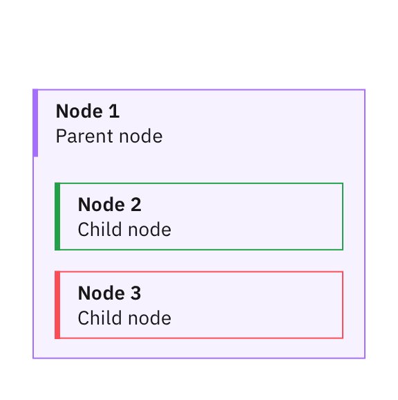
Don’t use a transparent background for nested elements because the color of child nodes may become unclear.
Don’t mix colors when drawing a node. Nodes should be monochromatic.
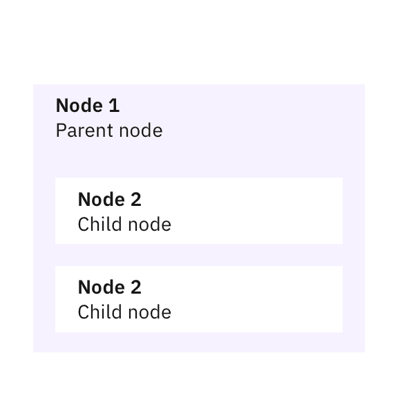
Don’t use low contrast for important graphic elements.
Don’t rely on background fills to differentiate between categories of elements.
Additional elements
Sometimes it’s desirable to provide additional information on a technical diagram. The elements described here are provided to help you translate complex concepts in your technical diagrams.
Line styles
Line styles can be used in nodes and connectors to indicate status, to mark changing elements or simply to distinguish between categories. For unlabeled connectors, it’s recommended to use line-style differentiations on top of color differentiation for accessibility consideration. Always include the line styles used in a diagram in the legend.
Indicator badges
To add another layer of meaning to a diagram, indicator badges can be used. They are 16px icons or shapes, optionally containing characters. They can be used with colors, including the alert colors, or in Black and White. These badges are used flexibly, for example, to show categories or statuses, or if a particular characteristic needs to be called out. However, a diagram should only use indicator badges for one reason at a time. Always add the indicator badges used in a diagram to the legend. For more information about status indicators, consult the Carbon status indicators guidance.
Multiple instances
To represent multiple instances of the same element, an offset effect can be used, as shown here. Always show an additional two offset lines, regardless of the actual number of repetitions. Mention the number of instances in parentheses at the end of the element name.


