How To
Summary
Understand the differences between the 3 types of EPS graphs in QRadar
Objective
Within QRadar, there are three main locations where EPS metrics are displayed for deployment:
- The QRadar EPS Dashboard represents values sent to the System Notification log source on the console from every managed host that receives events. The ecs-ec processes generate these metrics after licensing, parsing, and routing rules are applied before correlation occurs. These values do not include any events dropped due to license throttling or routing rules. This data is aggregated by the accumulator process on the console and can be affected by processing delays due to resource contention or delays in receiving the System Notification events from the managed hosts.
- The QRadar Deployment Intelligence (QDI) app makes API calls to access the Health Metrics events sent to the QRadar console from each managed host in the deployment. The Health Metrics log source maps to log source type ID 368. The EventRate metrics represent the EPS of raw incoming events seen at ecs-ec-ingress, where QRadar first receives the events. The EventRate health metric represents the raw rate of events received by QRadar before licensing is assessed.
- The QRadar Pulse app can create dashboards that query either the Health Metrics or System Notification events.
Steps
QRadar Dashboard (System Monitoring) EPS
The QRadar System Monitoring Dashboard contains a graph for Events Per Second (EPS) which can be configured to display any of 4 metrics:
- Events per Second Raw - Peak 1 Sec
- Events per Second Coalesced - Peak 1 Sec
- Events per Second Raw - Average 1 Minute
- Events per Second Coalesced - Average 1 Minute
The underlying search for this dashboard accumulates time-series data from StatFilter events. StatFilter EPS values are reported from every ecs-ec process in the deployment every minute.
Refer to this technote for a sample of the StatFilter events:
https://www.ibm.com/support/pages/qradar-event-rate-eps-graph-may-not-reflect-entire-event-load-system
A sample of the ecs-ec-ingress SourceMonitor message in the qradar.log:
Nov 2 10:09:00 ::ffff:xx.xx.xx.xx [ecs-ec-ingress.ecs-ec-ingress] [c1971a4e-3837-48b6-af69-8069246acb1f/SequentialEventDispatcher] com.q1labs.sem.monitors.SourceMonitor: [INFO] [NOT:0000006000][xx.xx.xx.xx/- -] [-/- -]Incoming raw event rate (5s: 6.60 eps), (10s: 5.20 eps), (15s: 7.40 eps), (30s: 6.93 eps), (60s: 21.28 eps), (300s: 20.95 eps), (900s: 20.95 eps). Peak in the last 60s: 129.60 eps. Max Seen 13866.20 eps. EC Throttles/5s (60s: 0.00). Total EC Throttles in the last 60s: 0. Total EC Throttles: 1564. Appliance Threshold: 5020.00
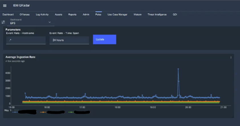
QRadar Deployment Intelligence EPS
By default, the QRadar Deployment Intelligence app has a built-in EPS dashboard that displays the ecs-ec-ingress SourceMonitor EPS rate.
By default, the QRadar Deployment Intelligence app has a built-in EPS dashboard that displays the ecs-ec-ingress SourceMonitor EPS rate.
One can also create an AQL search like this and plot an EPS graph in Log Activity:
AQL:
SELECT
  "Hostname" AS 'Hostname (custom)',
  MAX ("Value") AS 'Value (custom) (Maximum)',
  COUNT(*) AS 'Count'
from events
where
  "Metric ID" = 'EventRate'
  AND "deviceType" = '368'
GROUP BY "Hostname"
ORDER BY "Count" DESC
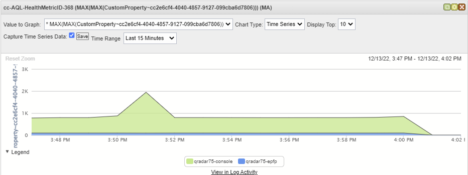
Steps to create Time Series graph in Log Activity to show the relevant Health Metrics data:
- Run the query and confirm the '
HostName' and 'Value' column contains data. - Once you run the search, click Save Criteria to save the search, and be sure to enable the 'Include in my Dashboards' checkbox. Provide a name for your saved search.
- In the Chart area of the graph display, switch to Time Series Chart Type.
- Select in the 'Value to Graph' list the 'Value (custom) (Maximum)' and then click the checkbox next to 'Capture Time Series Data' to enable Time Series, then click 'Save'.
- Confirm that the Time Series in the Chart area.
Sample graph:
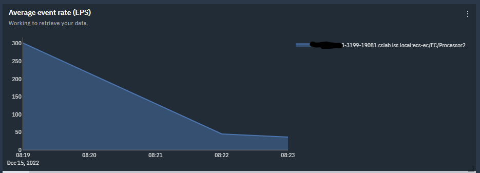
Pulse App EPS graph created with AQL search against Health Metrics events
The Pulse EPS dashboards can be created from either the StatFilter search or the Health Metrics search.
Steps to create dashboard by using Pulse:
- Click the Dashboard - Offense overview dropdown list, select Event and flow metrics
- Click the gear icon to show existing widgets. Find 'Create new widget'
- In the new widget window, enter the widget name EPS and Description.
- Under Query use Data Source: AQL, Refresh Time: Every 5 Minutes
- Copy and paste the AQL query to the query box.
AQL to use the Health Metrics values:
SELECT starttime/(1000*60) as minute, DATEFORMAT(starttime,'yyyy-MM-dd HH:mm:00') as showTime, Hostname, LONG(MAX(Value)) AS PeakEPS, LONG(AVG(Value)) AS AverageEPS FROM events WHERE devicetype = 368 AND "Component Type" = 'ecs-ec-ingress' AND "Metric ID" = 'EventRate' AND Hostname IMATCHES '{Event Rate - Hostname}' GROUP BY minute, Hostname ORDER BY minute ASC LAST {Event Rate - Time Span} - Click the Event Rate - Hostname field, then click the 'View Parameters' icon. When prompted, enter the missing parameters.
For Event Rate - Hostname, enter the hostname of interest. For example, console-xyz. Enable 'Set as default value'
For Event Rate - Time Span, enter number of hours. For example, 6 HOURS. Enable 'Set as default value - Enter the rest of the widget configuration:
Enter View Name: Health Metric 368
Enter Chart Type: Time Series Chart
Time (x-axis): showTime
Series Type: Dynamic Series
Split series by: Hostname
Values (y-axis): AverageEPS
Area Chart: On
Stacked Area Chart: On
Show Legend: On
* Be sure to click to enable the checkmark in the widget and click Save for it to be visible in the Pulse dashboard. - Click Save
Sample graph:
Pulse App EPS graph created from AQL search of StatFilter events
You can create a Pulse widget and dashboard by using the AQL query.
Pulse dashboard AQL query:
SELECT starttime/(1000*60) as minute,
DATEFORMAT(starttime,'YYYY MM dd HH:mm:ss') as showTime,
(minute * (1000 * 60)) as 'tsTime',
"Events per Second Raw - Peak 1 Sec" as EPS,
parent as aParent
from events
where aParent IN (select aParent FROM
(select parent as aParent,
"Events per Second Raw - Peak 1 Sec" as EPS
from events
where parent <> NULL and logsourceid in (65)
group by Parent
order by EPS
limit 5)
)
group by minute, parent
order by minute  ASC
last 1 hours
Sample graph:
In summary:
1. The QRadar EPS Dashboard displays graphs by using EPS metrics in StatFilter events that are generated by ecs-ec on managed hosts after licensing and parsing, and include information about event coalescing.
2. The QDI App displays EPS values sent from Ingress before licensing and parsing are applied.
3. The Pulse App Dashboard can display graphs from either the StatFilter or Health Metrics data.
Related Information
Document Location
Worldwide
[{"Type":"MASTER","Line of Business":{"code":"LOB24","label":"Security Software"},"Business Unit":{"code":"BU059","label":"IBM Software w\/o TPS"},"Product":{"code":"SSBQAC","label":"IBM Security QRadar SIEM"},"ARM Category":[{"code":"a8m0z000000cwt3AAA","label":"QRadar Apps"}],"ARM Case Number":"","Platform":[{"code":"PF025","label":"Platform Independent"}],"Version":"All Versions"}]
Was this topic helpful?
Document Information
Modified date:
02 March 2023
UID
ibm16590997