Troubleshooting
Problem
User has an existing chart in PAW. User clicks on the 'Change visualisation' button, which brings up a new screen where they can choose what type of chart/graph they want to display their date with.
User notices that some chart selections are not there (not available to select/choose). Why are some charts missing?
Symptom
Example:
In one PAW 2.0.37 environment, the following visualisation options were available:
- Exploration
- Bar
- Column
- Line
- Heat
- Packed Bubble
- Point
- Area
- Stack Bar
- Stack Column
- Tree Map
- Word Cloud
- Line and Column
- List
However, in a different PAW 2.0.37 environment, the following were available:

- Bubble
- Radial
- Line and Column
- Scatter Plot
- Tree Map
- Word Cloud
- Area
- Bar
- Column
- Line
- Packed Bubble
- Pie
- Point
- Radial Bar
- List
Cause
There are several possible explanations:
- Scenario #1 - The view has been configured differently
- The number of rows and column dimensions in a specific view, will dictate the specific charts that are available. PAW only shows the visualizations that can be rendered for the current view.
- For more details, see article 'Visualizations available by view configuration'
- Scenario #2 - The visualizations engine may be different (for example, one environment may be using a 'column based' visualization model)
- In PAW versions 2.0.34 (or earlier) customers have the old/original (not 'column based') visualisation model
- In PAW versions 2.0.35 to 2.0.37 (inclusive) customers are able to (optionally) change their visualizations engine to a 'column based' visualization model
- However, by default 'column based' is disabled
- In PAW versions 2.0.38 (and later), the 'column based' visualization model is enabled automatically (enforced - there is no option to disable it).
- For more details, see article 'Changes to visualizations'
Resolving The Problem
Scenario #1
Modify your view to allow the visualisation that you require.
- For more details, see article 'Visualizations available by view configuration'
Example:
In one real-life customer example, the solution was:
1. Enable the feature 'Column-charting' (see below in Scenario #2 for instructions)
2. Modify the cubeview so that there was only one element in the subset of the measure dimension.
Scenario #2
Fix:
This is by design.
- For more details, see article 'Changes to visualizations'
Workaround:
If using PAW 2.0.35 to 2.0.37 (inclusive) it is possible to enable/disable the 'column based' visualization model.
Steps:
1. Launch PAW
2. Click on your name, then 'Administer'

3. Click tab 'Features':

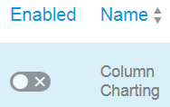
TIP: The current settings are displayed as follows:
Column Charting DISABLED:
 =
=
Column Charting ENABLED:

4. Click on the button underneath 'Enabled' to toggle (change) the setting
- TIP: You will receive a message similar to the following, which you will need to confirm (before the changes are made):

5. Test.
TIP: For more information about the above steps, see article 'Manage features'
Related Information
Was this topic helpful?
Document Information
More support for:
IBM Planning Analytics
Software version:
All Versions
Operating system(s):
Windows
Document number:
744683
Modified date:
20 September 2021
UID
ibm10744683