Technical Blog Post
Abstract
BiLog: Indecisiveness...Maximo BI Packs
Body
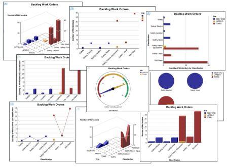
I can’t decide. Some days I want a pie. Other days, I only want a bar.
The new Maximo BI Workspaces are perfect for my indecisiveness. I can change the display of the metrics from a pie, to a bar or from a wide range of other graph types. Using the Work Order Metrics by Classification workspace as an example, I initially view the Backlog work order metric in column format.
This column format is very clear, but I want to re-structure this metric so I can view the data differently. Within the metrics or widgets toolbar, I simply select ‘Change Display Type’ and I’m presented with a variety of display options to choose from. I quickly select line and 3D graph type.
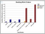
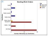
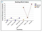
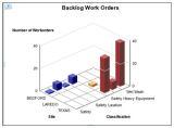
Within a matter of minutes, I can view my Work Order Backlog metric in a variety of formats. The wide variety of display options available provide incredible insight and visualization capabilities into the Maximo data sets.
I still can't decide which format I like best. To help you determine which you like best, you can view this functionality in a variety of recorded demos which are available here.
The demo recordings include a 7 minute demo on 'Customizing your Workspaces' using the various graph options with the features noted here.
Also, to learn more about the Maximo Cognos BI Packs, access the wiki pages here, or previous BiLog entries here
What graph will you choose?
[{"Business Unit":{"code":"BU059","label":"IBM Software w\/o TPS"},"Product":{"code":"SSLKT6","label":"IBM Maximo Asset Management"},"Component":"","Platform":[{"code":"PF025","label":"Platform Independent"}],"Version":"","Edition":"","Line of Business":{"code":"LOB59","label":"Sustainability Software"}}]
UID
ibm11133277