How To
Summary
Once you have an InfluxDB, and Grafana available in your computer room or on the cloud, you can then find many more use cases. In this article, I send the previously captured Temperature stats from my Raspberry Pi in my computer room and quickly get beautiful graphs.
Objective

Save interesting numeric data to a time-series database and get them flexibly graphed.
Environment
A Raspberry Pi computer, InfluxDB time-series database, and Grafana for live graphing.
Steps
In 2016, I set up a Raspberry Pi with five temperature probes to measure in my computer room:
- Air Conditioning output temperature
- Room Temperature
- Three Temperatures at the rear exhaust of three larger servers
You can find the article here
I end up with a script that gets the date+time and 5 temperatures. The data is saved in a Comma Separated Values file and then I run a bunch of scripts to generate .html web pages that use Google Chart JavaScript graphs. It took a couple of days to get right but then ran for many years - including four Air Conditioner failures that make interesting graphs!
I am getting in to InfluxDB, and Grafana, so I though an upgrade would be good.
On the Raspberry Pi, I run Ubuntu 16.04 and so Python so it is time to write a Python program to take the data and squirt the data into InfluxDB across the network.
The script gets called with the date+time in ISO <something-or-other> format and the five temperatures in Celsius.
The ISO-Timestamp example:
  #!/usr/bin/python3  #
Syntax:  inject.py Timestamp temp temp temp temp temp

import sys

host="ultraviolet"  port=8086
user = 'nag'  password = 'SECRET'
dbname = 'njmon14'
from influxdb import InfluxDBClient

client = InfluxDBClient(host, port, user, password, dbname)

entry = [{
'measurement': 'Temperature-Celsius',
'tags': {'host': 'IBM-Southbank' },
'time': sys.argv[1],
'fields': {
  'T1': float(sys.argv[2]),
  'T2': float(sys.argv[3]),
  'T3': float(sys.argv[4]),
  'T4': float(sys.argv[5]),
  'T5': float(sys.argv[6]) }
}]
ret=client.write_points(entry)  #print(entry)

#print("write_points() to Influxdb on %s db=%s worked=%s"%(host, dbname, str(ret)))
Comments
- Regular Python stuff
- First, set up the connection parameters to the InfluxDB
- Import the InfluxDBClient Python module
- Use InfluxDBClient to log on to the database
- Build the Python data structure that is a list of dictionaries. This example list has one entry but many could be injected in one go. The names of variables are fairly obvious. "measurement" is a keyword along with "time" and "fields". The tag makes it easier to look up in InfluxDB.
- Push the data to InfluxDB
- Ending with a couple of print statements to aid debugging - commented out so that it does not fill up a log file.
I have learned the hard way - don't immediately try graphing the data as a graph with just one or two points looks wrong!
So the next day: I set to with Grafana and in a few minutes, I have a nice graph as follows:

So how hard it to get that graph set up - Answer VERY EASY. Select the option to create a new graph and drag the edges to the size and place you want it. Click the Title line, and select the pop-down Edit. This panel covers five graphs on one pane but each is simple. As I hope, you can see in the following picture:
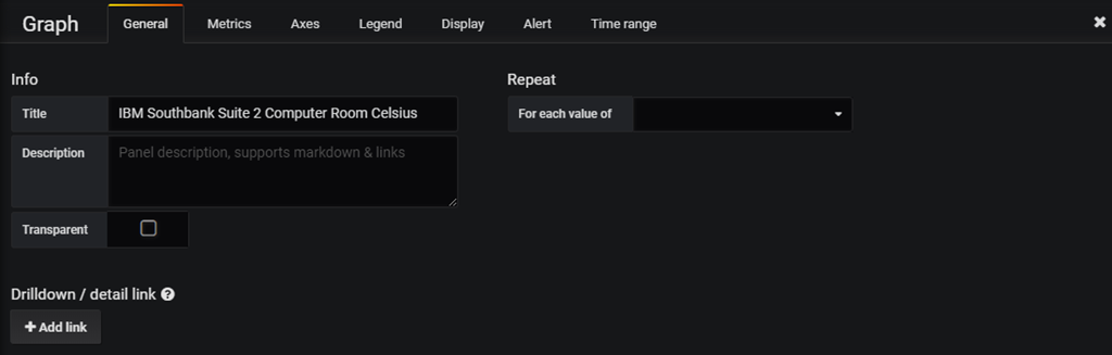
General Tab has the Graph title
Metrics Tab for the data you want

- Green arrow is the InfluxDB data source name.
- Blue is the measurement name.
- Red are the tags = host and value.
- Purple "T1" is one of the field names - for Temperature probe 1.
- Yellow is the name that I want on the graph - here AirCon (Air Conditioning).
- I also changed the Axes Tab to make the graph bottom to include zero Celsius and the Display to have Lines and Points.
- I can change the colours of the graphs by clicking the data name Key on the graph.
- Everything else is automatically completed.
By the way:
Early on, I move one temperature probe from my S822 to the S924 - You can see the drop on temperature on the left of the orange line - interesting that the POWER9 servers run cooler. The slight rise from initial dip is because I ran up a whole load of hard working programs to keep the CPUs busy - it did not make the machine heat up much - good news.
Now we have data in a time series database that we can zoom in and out and cross-compare these stats to the others I am collecting from
- AIX, VIOS, and Linux with njmon (more to come in a future blog) and also data extracted from the
- HMC REST API for Temperature, Watts, whole server stats and LPAR level stats see
nextract plus HMC REST API Performance Stats and Energy
The various sources of stats can all be drawn on one graph or side by side on one screen.
Conclusions:
- Once you have these tools, you can't live without them.
- There are other similar tools like Elastic-search (ELK), Prometheus, or Graphite. Some are open source with Enterprise versions with full support and training available or Cloud versions as a service. There is also Splunk - it is not open source.
Additional Information
Other places to find content from Nigel Griffiths IBM (retired)
- YouTube - YouTube Channel for Nigel Griffiths
- AIXpert Blog
Document Location
Worldwide
Was this topic helpful?
Document Information
Modified date:
30 December 2023
UID
ibm11114095