Cost vs Budget
Cost vs Budget
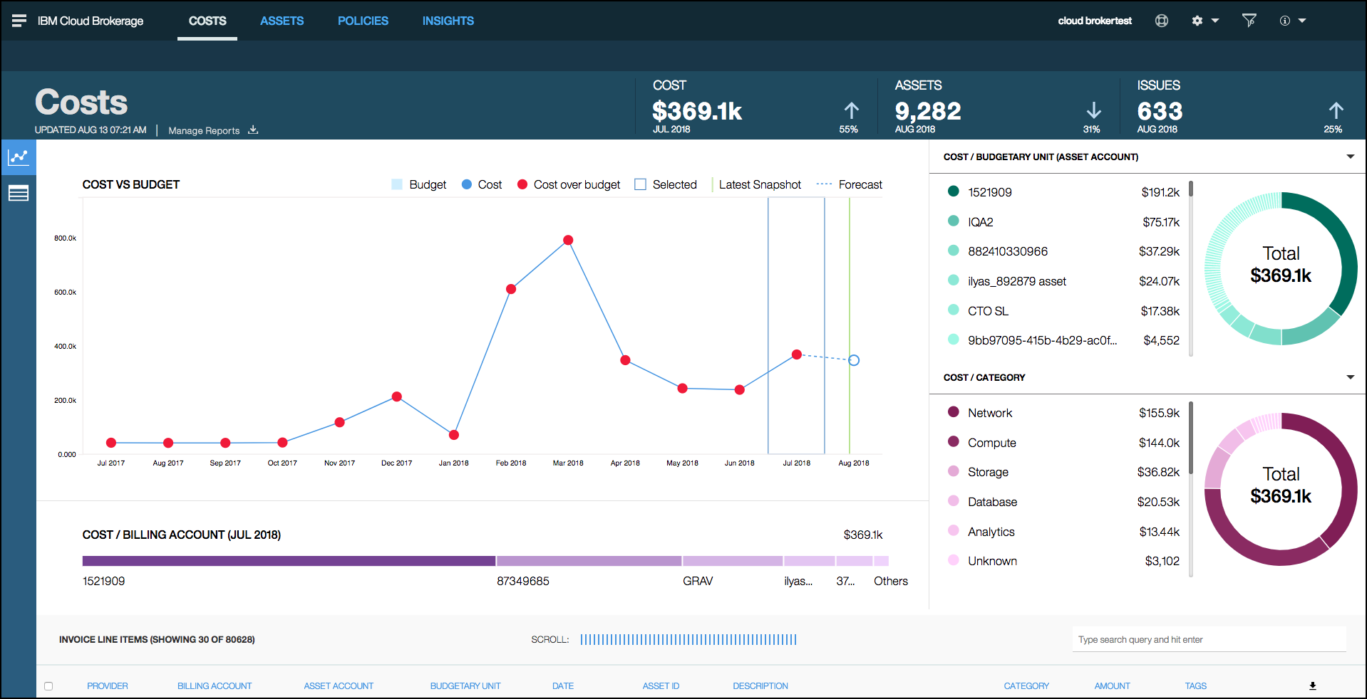
Use the Cost vs Budget interactive chart to compare your budget to your costs, view trends, and forecast costs.

These charts are useful for monitoring trends, such as increasing costs for resources (such as storage or a database) and cost variances. The red dot indicates that the cost has exceeded the budget.
Selecting the current month displays forecast, budget, and month-to-date costs. The forecasted cost is based on the last fully completed month. Users can select the current month and see the cost line items for month-to-date details, costs, and associated asset details in the Invoice Items list.
Viewing Data for a Specific Month
To view data for a specific month:
-
Click in the chart to select the month. All of the other graphs on the screen display the data for the selected period.

The graph displays 14 months of data and consists of the last completed full month and 12 previous months of historic data with forecast data. By default, the system selects the last completed full month.
-
Click to select a specific month to view more information.
Cost vs Budget Legend

- Monthly budgets are displayed as blue bars.
- Monthly costs are displayed as blue points on the chart and connected by a line.
- Cost points that exceed the budget are displayed in red.
- The cost forecast value is represented with a circle without fill, in blue outline if under budget, and with a red outline if over budget. The points for default month and forecast month are connected by a dotted line.
- The vertical green line represents the last-view date. The line remains that way until the next view.
- When budget data is not available, the chart does not display blue bars. Data in the graph reflects the applied global filters. The local filters are applied in the other cost grpahs within this dashboard.