Cluster Profiles
- In the main view, select Clusters from the
dropdown to display the Clusters view.
Figure 1. Clusters table 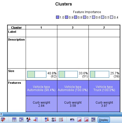
By default, clusters are sorted from left to right by cluster size, so they are currently ordered 1, 3, 2.
Figure 2. Cluster profiles: cells show cluster centers 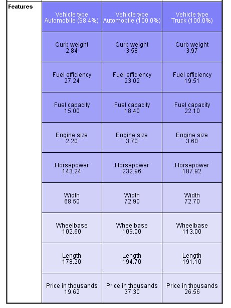
The cluster means suggest that the clusters are well separated.
- Motor vehicles in cluster 1 are cheap, small, and fuel efficient automobiles, except for a single truck (the 1.6% of the cluster not comprised of automobiles).
- Motor vehicles in cluster 2 (column 3) are moderately priced, heavy, and have a large gas tank, presumably to compensate for their poor fuel efficiency. Cluster 2 is also entirely comprised of trucks.
- Motor vehicles in cluster 3 (column 2) are expensive, large, and are moderately fuel efficient automobiles.
Figure 3. Cluster profiles: cells show absolute distributions 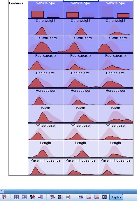
- The cluster means (for continuous fields)
and modes (for categorical fields) are useful, but only give information
about the cluster centers. In order to get a visualization of the
distribution of values for each field by cluster, click on the Cells show absolute distributions button
in the toolbar.
Now you can see, for example, that there is some overlap between clusters 1 and 3 on curb weight, engine size, and fuel capacity. There is considerably more overlap between clusters 2 and 3 on these fields, with the difference that the vehicles with the very highest curb weight and fuel capacity are in cluster 2 (column 3) and the vehicles with the very highest engine size appear to be in cluster 3 (column 2).
Figure 4. Cluster profiles: cells show absolute distributions 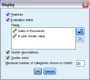
- To see this information for the evaluation fields, click on the Display button in the toolbar.
- Select Evaluation fields.
- Click OK.
The evaluation fields should now appear in the cluster table.
Figure 5. Cluster profiles for evaluation fields: cells show absolute distributions 
The distribution of sales is similar across clusters, except that clusters 1 and 2 have longer tails than cluster 3 (column 2). There is a fair amount of overlap in the distributions of 4-year resale value, but clusters 2 and 3 are centered on a higher value than cluster 1, and cluster 3 has a longer tail than either cluster 1 or 2.
- For another way to compare clusters, select (control-click) on the cluster numbers (column headings) in the clusters table.
- In the auxiliary view, select Cluster Comparison from the dropdown.
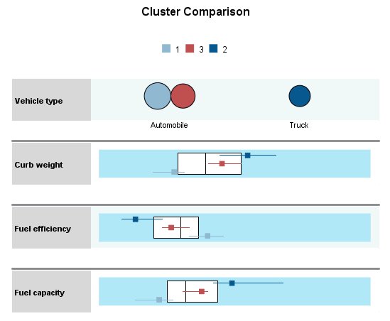
For each categorical field, this shows a dot plot for the modal category of each cluster, with dot size corresponding to the percentage of records. For continuous fields, this shows a boxplot for the distribution of values within each cluster overlaid on a boxplot for the distribution of values overall. These plots generally confirm what you've seen in the Clusters view. The Cluster Comparison view can be especially helpful when there are many clusters, and you want to compare only a few of them.